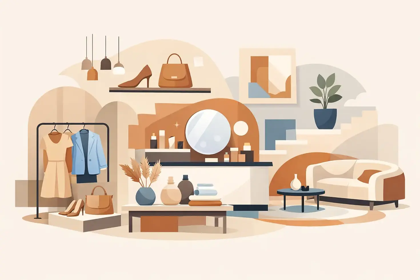
12 Best Retail Interior Design Ideas

A customer decides how a store feels before they process what it sells. The threshold, the sightline, the lighting temperature, the pace of movement - these details shape perception fast. The best retail interior design ideas work at that speed, giving a brand immediate clarity while supporting how people browse, pause, and buy.
Retail interiors are often reduced to visual merchandising. That is too narrow. A strong store is part architecture, part psychology, part stage set. It needs to communicate brand character, manage circulation, frame product appropriately, and remain flexible enough to change with seasons or launches. The most effective concepts do not rely on novelty alone. They create atmosphere with control.
What the best retail interior design ideas actually do
The best retail interior design ideas are not simply decorative moves. They solve a set of overlapping questions. How does a customer enter the space? Where does the eye land first? What deserves compression, and what deserves breathing room? Where should discovery happen, and where should decision-making feel calm?
This is where many stores overdesign. They chase impact and lose hierarchy. A better approach is to let the interior hold a clear point of view, then edit hard. Materials, fixtures, and layout should reinforce the same spatial message. If the brand is quiet and elevated, the room should not shout. If the offer is energetic and trend-led, the plan can move faster, but it still needs order.
1. Design the first five feet with intent
The entrance sets the tone, but it also sets behavior. A decompression zone just inside the door gives people a moment to adjust before they engage with product. Without it, even a beautiful display can be missed.
This area should feel deliberate rather than crowded. One strong gesture is usually enough - a feature table, a sculptural rail, a disciplined material shift, or a framed seasonal display. The aim is orientation, not saturation.
2. Build clear sightlines through the store
Customers should understand the space almost instantly. Long views create confidence. They help visitors locate focal points, category zones, fitting rooms, or the cash wrap without searching.
Open sightlines do not mean every store should be sparse. They mean visual logic should be legible. In smaller footprints, this may come from disciplined fixture heights. In larger stores, it may come from axial planning or repeated architectural cues that pull the eye forward.
3. Use lighting as spatial editing
Lighting is one of the most underestimated retail tools. It can flatten a space or give it depth. It can make merchandise feel premium, clinical, warm, or forgettable.
A layered approach tends to work best. Ambient light establishes comfort, accent light gives product emphasis, and decorative light adds identity. The balance matters. Too much even light removes drama. Too much spotlighting makes browsing tiring. In fashion, beauty, and hospitality-led retail in particular, the right contrast creates mood and sharpens perception of material and color.
4. Give product the right amount of space
Not every item benefits from density. Luxury retail often depends on restraint, while high-volume categories may need abundance to signal choice and access. The correct answer depends on the price point, the customer, and the brand position.
Spacing is therefore strategic. Hero products need room around them. Supporting products can sit more tightly. If everything is treated as important, nothing is. Good interiors understand visual pacing and allow moments of pause between information.
5. Treat materials as part of the brand language
A retail interior should feel consistent with the brand, not just decorated in its colors. Material choices do much of that work. Stone, timber, plaster, powder-coated steel, polished lacquer, linen, glass, and brushed metal all carry different cultural associations.
The strongest stores choose a material palette with discipline and use it repeatedly enough to create recognition. Often, fewer materials produce a more expensive result. Texture also matters. Matte surfaces absorb light and quiet the room. Gloss reflects and energizes it. Neither is inherently better. It depends on the atmosphere required.
6. Create zones without breaking the whole
Customers like variety, but they also need coherence. Zoning helps distinguish product categories, launch areas, private consultation points, or service moments. The mistake is making each zone feel like a separate concept.
Instead, subtle shifts are often more refined. A rug can define a seating area. A change in wall finish can signal a premium section. Lower lighting can create intimacy around a fitting room or jewelry display. The store stays legible as one environment while still offering nuance.
7. Make fixtures architectural, not generic
Off-the-shelf systems can be practical, but they rarely give a store distinction. Custom or semi-custom fixtures allow the display language to feel embedded in the architecture rather than placed into it.
That does not mean every element must be bespoke. It means key pieces should carry the design intent. A central display table, a freestanding shelving rhythm, a curved rail, or a built-in banquette can establish authorship. For brands that care about image, these details tend to matter more than decorative styling.
Best retail interior design ideas for movement and dwell time
Flow is rarely accidental. It is shaped through plan, proportion, and interruption. Some stores benefit from a directed path, especially when storytelling or sequential merchandising matters. Others need looser circulation so customers can wander.
In either case, moments to stop are essential. A bench, consultation table, fragrance bar, fitting room lounge, or textured threshold can slow the experience in the right way. Retail is not just about movement. It is also about permission to linger.
8. Add one memorable gesture
Every strong retail interior needs a focal memory. This might be a dramatic staircase, a monolithic stone cash desk, a mirrored ceiling, an unexpectedly domestic curtain treatment, or a gallery-like wall niche. The point is not spectacle for its own sake. It is recognizability.
A memorable gesture gives the space image value. It helps the store live beyond the visit, in photography and in recall. The most effective versions feel tied to the brand rather than imported from trend cycles.
9. Design fitting rooms and service points with care
Retail operators often spend heavily on the sales floor and underthink the spaces where decisions actually happen. Fitting rooms, consultation corners, and point-of-sale areas carry outsized influence. If they feel cramped, harshly lit, or unresolved, the overall impression drops quickly.
These spaces should be comfortable and controlled. Good lighting, flattering mirrors, a practical ledge, a hook in the right place, and acoustic softness are not extras. They are part of the sales environment. The same applies to checkout. It should feel integrated, not like an afterthought at the edge of the room.
10. Plan for change from the start
Retail is seasonal, promotional, and often collaborative. Interiors that cannot adapt become dated faster than they should. Flexibility is not glamorous, but it is one of the more intelligent investments.
This can be handled quietly through movable plinths, adjustable shelving, hidden power, modular display components, and wall systems that accept change without visual clutter. The challenge is keeping flexibility from looking temporary. The best solution is usually a stable architectural framework with adaptable inserts.
11. Let back-of-house support the front
A polished customer experience depends on what is not seen. Storage, stock access, staff circulation, wrapping areas, and operational clearances all affect the calm of the sales floor. If these are poorly resolved, the space will feel messy no matter how elegant the finishes are.
This is where interior architecture earns its keep. The front-of-house image and the back-of-house logic should be developed together. A store that functions well tends to look better because it can stay composed throughout the day.
12. Use restraint to make the brand more visible
Many brands assume a stronger interior requires more features, more color shifts, more signage, more display types. Often the opposite is true. Restraint can sharpen identity because it removes competing signals.
A tightly edited room gives product and brand graphics more authority. It also tends to age better. Trend-based details date quickly, while proportion, material honesty, and thoughtful composition hold their value. For design-led retailers, this matters.
When these ideas need to change
Not every retail category should follow the same rules. A luxury boutique can lean into negative space and tactile finishes. A beauty store may need brighter testing areas and denser product engagement. A concept store can tolerate ambiguity if discovery is part of the appeal. A high-volume apparel chain usually needs stronger circulation and faster legibility.
Location matters too. A neighborhood store may benefit from warmth and familiarity. A destination flagship can be more spatially ambitious. Budgets also shift the answer. A limited budget does not rule out a strong interior, but it does require discipline. It is often better to execute fewer moves properly than to spread resources thinly across too many ideas.
For brands with a strong visual identity, retail can borrow intelligently from set design. Temporary interventions, launch moments, and campaign-led displays can bring freshness without rebuilding the entire environment. That crossover between permanence and staging is often where a store becomes most visually alive.
The stores that stay with people are rarely the busiest or the most decorated. They are the ones with control - a clear mood, a confident plan, and just enough surprise. If the space knows what it is trying to say, customers usually feel it before they ever put it into words.


Comments