
Best Materials for Luxury Interiors

Luxury is rarely a matter of cost alone. In the strongest rooms, it reads through material intelligence - the weight of stone at the threshold, the softness of wool underfoot, the way natural wood catches late afternoon light. The best materials for luxury interiors do more than signal expense. They create atmosphere, hold up to use, and give a space its lasting point of view.
That distinction matters because high-end interiors are often judged too quickly by finish schedules and product lists. Real quality sits elsewhere. It sits in restraint, in proportion, and in choosing materials that improve with time rather than simply photograph well on day one. A polished brass fitting may feel excessive in one room and entirely right in another. A dramatic marble can elevate a powder room, then overwhelm a quiet residential kitchen. Material selection is always contextual.
What makes a material feel luxurious
The simplest answer is depth. Materials with variation, tactility, and a visible relationship to time tend to read as more refined than flat, overly processed surfaces. Natural veining in stone, subtle grain in oak, the irregularity of hand-applied plaster - these details create visual movement without relying on ornament.
There is also the question of performance. Luxury interiors are not museum pieces. A hospitality lounge, a family kitchen, and a retail fitting room each place different demands on the same surface. The material has to be appropriate to the setting, not just attractive within it. That is often where expensive mistakes happen: a delicate finish specified for a high-contact area, or a beautiful stone chosen without considering porosity, maintenance, or light exposure.
The best schemes balance sensory richness with technical discipline. They do not use every premium finish at once. They edit.
Best materials for luxury interiors in practice
Natural stone
Stone remains one of the clearest markers of permanence. Marble, limestone, travertine, and quartzite each bring a different character, and those differences matter. Marble has softness and drama, but it etches and stains more easily than clients often expect. That can be acceptable, even desirable, in lower-traffic applications where patina is part of the appeal.
Quartzite offers a similar visual presence with greater durability, which makes it useful for kitchens and heavily used bathrooms. Limestone is quieter. It carries less contrast, often feels architectural rather than decorative, and works particularly well when the brief calls for calm rather than spectacle. Travertine, when specified well, introduces warmth and a slightly more relaxed formality.
The luxury is not simply in selecting stone. It lies in how it is cut, finished, and detailed. Honed surfaces often feel more sophisticated than highly polished ones. Bookmatching can be striking, though it needs restraint. Thick stone edges, integrated sinks, and carefully aligned veining all contribute to the final impression.
Solid wood and wood veneer
Wood gives luxury interiors their most important counterpoint: warmth. Without it, many high-end spaces become cold, regardless of budget. White oak, walnut, and smoked or stained timber are enduring choices because they offer depth without demanding attention.
Solid wood has obvious appeal, though veneer is often the more precise option for cabinetry and architectural paneling. A well-made veneer allows consistency across large surfaces and can achieve a cleaner, more controlled result than solid planks, which naturally move over time. In refined interiors, that control matters.
Finish is decisive here. Open-pore and matte finishes tend to feel more contemporary and more expensive than heavy gloss. The goal is to let the grain remain visible and tactile. Wood should not feel entombed beneath lacquer unless that is a deliberate period reference.
Plaster and limewash
Paint can be flat in every sense. Plaster and limewash offer something more spatial. They catch light unevenly, soften edges, and give walls a sense of mass. In rooms where the architecture is relatively simple, these finishes add quiet complexity without clutter.
Venetian plaster can be sleek and polished, but it needs discipline. Used excessively, it can tip into theatricality. Limewash is often gentler, with tonal variation that works especially well in bedrooms, entry halls, and spaces where atmosphere matters more than sharp definition.
These finishes are particularly effective in projects that favor minimal detailing. When there is less trim, less ornament, and fewer interruptions, the wall surface itself has to do more visual work.
Metal with patina
Luxury interiors benefit from metal, but almost never from too much of it. The most persuasive applications are controlled and architectural: a bronze-framed partition, a brushed nickel faucet, an aged brass pull that gains character with use.
Brass, bronze, blackened steel, and pewter each sit differently in a palette. Bright chrome can feel crisp, though it is less forgiving and often less nuanced. Unlacquered brass remains compelling because it changes over time. That evolution makes a room feel inhabited rather than fixed.
Consistency is useful, but perfect matching is not always necessary. In fact, a room can feel more developed when metals are related rather than identical. The key is temperature and intention. Warm metals generally sit better with stone, plaster, and timber than colder, highly reflective finishes.
Wool, linen, silk, and leather
Textiles are often where luxury becomes tangible. You register them through touch before you fully process them visually. That makes fabric choices especially important in residential and hospitality settings, where comfort and perception are closely linked.
Wool is one of the most versatile materials available. It performs well in upholstery and rugs, offers softness without fragility, and carries color beautifully. Linen brings ease and movement, though it wrinkles and wears in a way clients need to be comfortable with. Silk has undeniable depth and luster, but it is better reserved for lower-impact applications or formal rooms where durability is not the first concern.
Leather remains valuable because it ages. The right hide develops character rather than simply showing wear. That said, quality varies sharply. Corrected-grain leathers can feel flat and overly uniform. Full-grain options tend to have more richness, though they also reveal life more honestly.
Glass
Glass is rarely the hero material in a luxury interior, but it is often what keeps the scheme from feeling heavy. Reeded glass, smoked glass, and low-iron clear glass each offer different levels of privacy, reflectivity, and sharpness.
Used in partitions, cabinet fronts, tabletops, and lighting, glass introduces contrast and precision. It works best when paired with more tactile materials. Against plaster, oak, or stone, it creates tension. On its own, it can feel too clinical.
High-quality composites and engineered surfaces
Not every luxury material needs to be purely natural. In some contexts, engineered surfaces are the more intelligent choice. Porcelain slabs, for example, can perform exceptionally well in bathrooms, kitchens, and hospitality settings where durability and maintenance are non-negotiable.
The issue is not whether a material is natural or manufactured. The issue is whether it looks convincing, feels appropriate, and resolves a practical problem without compromising the design. Some composites now offer remarkable restraint in pattern and finish. Others still read as imitation. The distinction is immediate.
How to choose the best materials for luxury interiors
Selection begins with the role of the room. A formal dining space can tolerate delicacy. A beach house kitchen cannot. A retail environment may need harder, more resilient finishes than a private dressing room, even if both are intended to feel equally elevated.
Light is the next filter. North-facing rooms often benefit from warmer woods, richer metals, and stones with cream or tobacco undertones. Very bright spaces can carry cooler palettes, deeper contrast, and more reflective surfaces without feeling stark.
Then there is maintenance. This is where honest conversations matter. Some clients love patina in theory and dislike it in practice. Etched marble, darkened brass, softened linen - these are beautiful forms of wear if they are expected. If not, they quickly become points of frustration.
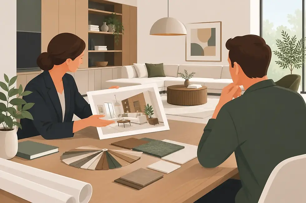
The most successful interiors are usually built from a restrained mix: one dominant architectural material, one balancing warm element, one metal, and a textile story that softens the whole. George Jessel Interiors approaches materiality in exactly this spirit - as composition, not accumulation.
Expensive does not always mean right
There is a tendency in luxury projects to over-specify. Too many stones, too many special finishes, too much contrast. The result is often less sophisticated, not more. A room with a single exceptional limestone floor and beautifully detailed oak millwork will usually outlast a room trying to impress through sheer variety.
True luxury comes from confidence in what to leave out. It is felt in the thickness of a door reveal, the dry finish of plaster, the weight of a linen drape, the quiet confidence of materials that do not need explanation.
If there is a useful test, it is this: choose materials that still feel convincing when the styling is gone. Remove the flowers, the books, the lighting mood, and the room should retain its authority. That is usually where the right material palette begins.


Comments