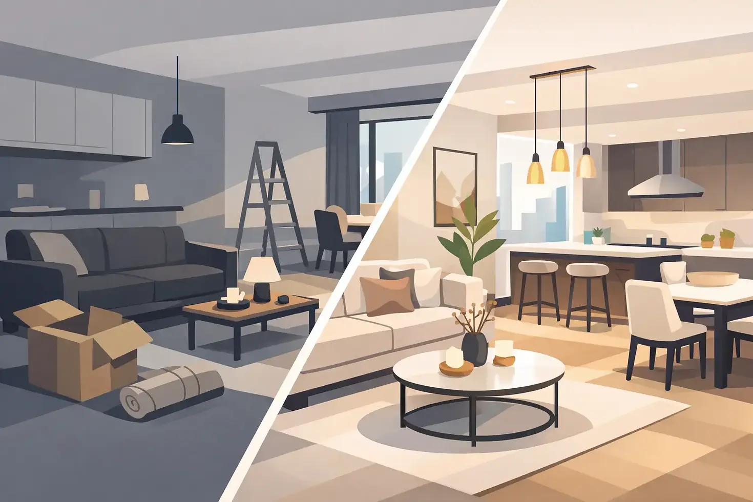
A Luxury Apartment Redesign Example

The problem with many expensive apartments is not budget. It is misalignment. Rooms are often generously sized yet oddly proportioned, flooded with daylight but underlit at night, finished in premium materials that never quite form a coherent interior. A strong luxury apartment redesign example is useful for that reason. It shows how value is created not by adding more, but by editing, clarifying, and composing the space properly.
In high-end residential work, redesign is rarely about decoration alone. It is about hierarchy, flow, and mood. The best schemes resolve architecture and interior language together, so that the apartment feels inevitable rather than styled.
A luxury apartment redesign example in practice
Consider a prewar apartment in a prime urban building - generous ceiling height, good bones, and a sequence of rooms that have been altered over time. The entrance is narrow and dim. The living room is impressive on paper but fragmented by oversized furniture and inconsistent finishes. The kitchen is technically functional, though visually detached from the rest of the home. The primary suite has square footage, but no sense of calm.
This is a familiar brief in luxury property. The client is not asking for novelty. They want order, beauty, and a home that reflects a developed point of view.
The redesign begins with subtraction. Decorative clutter is removed from the decision-making process. Existing conditions are studied for what is worth retaining - original molding, window proportions, stone thresholds, a fireplace surround with character. In an apartment of this kind, the strongest move is often to preserve the architectural cues that give the space credibility, then sharpen everything around them.
That means the plan is adjusted only where it materially improves use. A wall between kitchen and dining space might be widened rather than fully removed. Sightlines matter, but so does containment. Open plans can feel thin in luxury interiors when every function is visible at once. Partial openness often produces a more composed result.
What changes first in a high-end redesign
The first substantial shift is usually spatial legibility. In weaker apartments, every room tries to do too much. The redesign assigns each zone a clear role and then connects them through proportion and finish rather than repetition.
The entry sequence is a good example. Instead of treating it as a leftover corridor, it becomes a threshold. A plastered wall finish with soft reflectivity, a controlled ceiling detail, and one sculptural light fitting can establish the apartment's tone within seconds. If the first moment is unresolved, the rest of the interior has to work harder.
The living room is then recalibrated around scale. Large apartments are often furnished as if size alone creates luxury. It does not. Luxury comes from balance. Seating is pulled into a more deliberate arrangement, with circulation left around the perimeter rather than cutting through the middle. A rug is chosen for architectural proportion, not simply softness. Case goods are reduced. The room begins to read as a single composition.
In the kitchen, the question is less about features than visual discipline. Many high-end kitchens are overdesigned, packed with statement stone, heavy hardware, and too many competing finishes. A better solution is quieter. One timber tone, one stone, one metal, and cabinetry detailed with precision rather than ornament. If the apartment opens between kitchen and living areas, this restraint becomes even more important. The kitchen should support the broader interior language, not interrupt it.
Materials are where the redesign either matures or collapses
A convincing luxury apartment redesign example always reveals careful material editing. Costly surfaces alone are not persuasive. The issue is adjacency. How one stone meets wood, how painted surfaces absorb light, how metal is repeated just enough to feel intentional.
For this apartment, the palette remains spare. Pale oak floors replace a darker, red-toned timber that made the rooms feel dated. Walls shift to warmer neutrals with mineral depth rather than flat white. In wet areas, stone is selected for consistency and texture rather than dramatic veining. There is confidence in reduction.
This does not mean minimalism for its own sake. Some clients want richer contrast, stronger color, or more decorative layering. That can work beautifully, but only when the framework is controlled. Without that discipline, luxury quickly turns theatrical. In residential design, sophistication usually sits in what has been withheld.
Custom millwork also carries more weight than people expect. Built-ins can correct awkward corners, conceal practical needs, and establish architectural rhythm across a room. Done badly, they feel bulky and overdetermined. Done well, they seem to have belonged to the apartment from the start.
Lighting decides how expensive a space feels
Natural light earns attention in listing photographs, but artificial light is what makes an apartment livable. This is where many redesigns quietly succeed or fail.
In this example, the lighting plan is layered rather than dramatic. Ambient lighting is integrated into ceiling and joinery details so the apartment is evenly lit without glare. Decorative fixtures are used selectively, almost as punctuation. Picture lights, low-level lamps, and concealed shelf lighting create depth in the evening, when hard architecture softens and material texture comes forward.
There is a trade-off here. Highly integrated lighting requires coordination and precision during construction. It is less forgiving than adding decorative fixtures late in the process. But in luxury interiors, that early discipline is usually visible in the final result. Spaces feel calmer when light has been considered structurally, not applied as an accessory.
The primary suite should feel edited, not indulgent
Bedrooms in expensive apartments are often treated as opportunities for excess. Multiple feature walls, oversized beds, and too many finishes can make the room feel hotel-like in the wrong way.
A stronger approach is quieter. In this redesign, the primary bedroom is organized around symmetry and softness. Upholstered elements are used to absorb sound and visual hardness. Window treatments run full height to reinforce the room's verticality. Storage is integrated rather than displayed. The effect is not sparse. It is settled.
The bathroom follows the same logic. Luxury comes from clarity of use and tactile quality - a well-proportioned vanity, carefully placed mirror lighting, stone that continues without awkward interruption, and enough concealed storage to keep surfaces clear. If there is one lesson repeated across high-end residential work, it is that visual calm requires practical rigor.
Why this luxury apartment redesign example works
What makes this kind of project persuasive is not spectacle. It is coherence. Every decision appears to belong to the same interior mind.
That is particularly relevant for clients who move between cities, properties, and visual cultures. A transatlantic design sensibility often values both structure and atmosphere - the architectural discipline associated with European interiors and the ease of American residential living. When those qualities are combined well, the apartment feels polished but not rigid.
This is also why references from hospitality and set design can sharpen residential work. Both disciplines understand sequencing, mood, and the power of controlled perspective. A home should not feel staged, but it should benefit from that level of visual intelligence. George Jessel Interiors approaches space with that kind of cross-disciplinary precision.
What clients should take from a redesign example
If you are evaluating your own apartment, the question is not whether it needs a full transformation. It is whether the current space has a clear point of view. Some apartments need structural changes. Others need a more disciplined material palette, better lighting, and furniture planning that respects the room.
The right answer depends on the property. A landmarked apartment may demand restraint. A new-build tower residence may need more architectural character introduced through millwork, stone, and proportion. A pied-a-terre may prioritize atmosphere over storage, while a full-time family apartment will need a stronger practical backbone.
That is the value of looking at a luxury apartment redesign example with a critical eye. It clarifies what the redesign is actually doing. Not adding prestige, but shaping experience. Not chasing trend, but establishing permanence.
The most successful apartments do not announce every decision. They feel composed, easy, and exact. When redesign reaches that level, the space stops performing luxury and starts living up to it.


Comments